The Archive will be closed to the public on Friday 3rd and Monday 6th April

From the beginnings of the business, Michael Marks wanted to make shopping a simple and enjoyable experience.
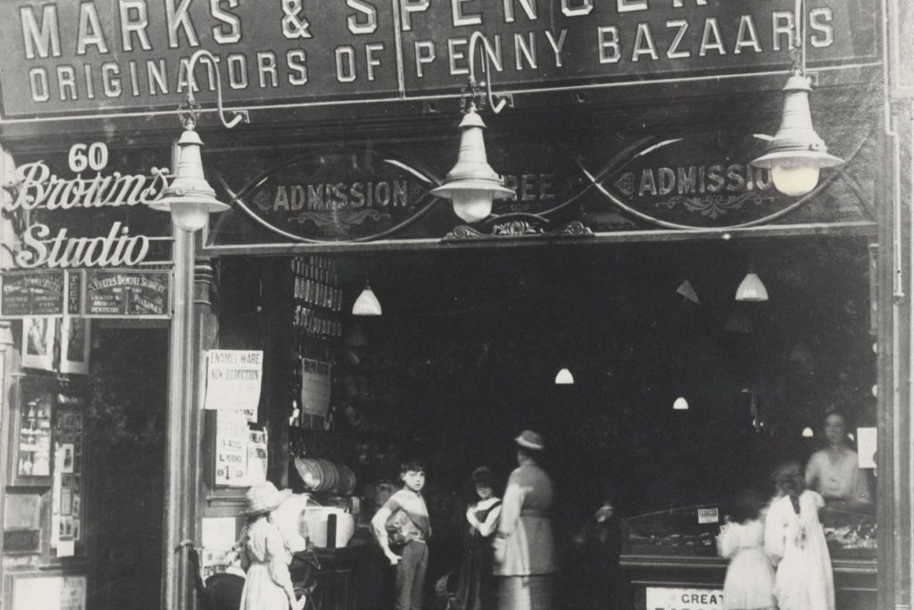
Products were laid out on tables, so that customers could examine items. Signs carried the slogan, ‘Don’t ask the price, it’s a penny’.
In 1894 Michael went into partnership with Tom Spencer, and new Marks & Spencer branches were opened in shop premises.
Shop fronts were painted red and used eye-catching signage. Our Penny Bazaars had large ‘Admission Free’ and ‘Inspection Invited’ signs in gold lettering – an early marketing strategy to show customers that this was an experience other stores didn’t offer.
In 1916 Michael’s son Simon took over the business and modernised stores, moving towards a department store model.
At the time Simon took over, window display design was built around putting out as much stock as possible. This also applied inside the store where goods were piled high on every surface.
This wasn’t without strategy. Emphasis was placed on seasonality: for example, household goods would be prominently displayed for spring cleaning, fleecy gloves would be featured in winter and swimsuits in the summer.
The 1920s saw huge expansion at M&S, and in 1926 we started to sell clothing.
New, larger stores were built and old stores were expanded, with wider aisles and better lighting.
A 1927 staff bulletin states how the window was the ‘mirror to the store’. We said ‘A window is not properly dressed if it looks as though a heap of goods has been thrown into it. Merely to fill a window is not to dress it’.
Products were grouped by use and department, for example, slippers with stockings or men’s ties with shirts.
We said: ‘People come to our stores because they are bright and attractive, and … satisfy their spirit for entertainment … the display should be an entertainment and instruction for the passers-by’ Staff Bulletin, 1928.
In the 1940s, blackout rules meant that our stores lost window display space.
Stock was in short supply so stores quickly looked empty and less inviting. One solution to this problem was the introduction of Café Bars.
In 1939 we had Café Bars in three stores, by the end of the war there were 80. As well as providing customers with a cheap meal, they were ideal for filling floor space and making stores look full!
During the war 16 stores were destroyed and many were damaged. To keep trading, we opened temporary stores as quickly as possible.
When Sheffield store was destroyed, we moved into the nearby Lansdowne cinema. The building had its own challenges, special counters were built to fit the sloping floor and dress racks were screwed onto blocks of wood to stop them rolling away.
Staff training in Visual Merchandising continued after the war.
This Display Manual from April 1948 states, ‘Few things have changed more during our lifetime than the practice of display, and in this process the profession has gained prestige and is recognised as a new type of industrial art’.
Display manuals gave tips on how to create arrangements, colours that worked together, design and grouping.
In 1946 we advertised store jobs in a leaflet entitled A Girl’s Future, including a section on Window Dressing School. We said ‘The Sales Assistant with a good eye for display qualifies as a Window Dresser’.
In the 1950s we began to standarise store appearance, making M&S easy to recognise on the high street.
Wood panelling was replaced by open plan layouts with more light and more hanging space to display clothing.
Simon Marks said ‘We are building a fairyland on the high street’ Paul Bookbinder, Simon Marks: Retail Revolutionary, 1993.
Window dressers and floor supervisors were encouraged to work together to create displays, and to share knowledge with other staff.
In 1952 we said ‘Be ready to discuss elementary principles of display and colour blending, with anyone who shows interest. The more ‘display-minded’ people there are in store the better’ Staff Management News, May 1952.
This two-minute advert from 1963 was shown in cinemas before the main feature.
It ran in cinemas near stores where building work was in progress.
As you’ll see, the information we gave customers is interesting, as well as talking about our improved layout and the ease of shopping in store, there’s a lot of emphasis on the number of doors in the new building!
The role of employees in the look of the store was as important as the products.
There was no formal uniform in the early days of M&S, sales assistants wore a black dress or a white collar, for example, until a standardised uniform was introduced in the 1940s.
A 1927 staff bulletin gives tips for increasing sales on the Confectionery department. We said ‘Clean, healthy looking girls are required … they should be given facilities for keeping their hands clean and their nails manicured. Nothing puts a customer off so much as to be served sweets by an untidy looking girl’.
Sales assistants in the 1950s received advice on how to dress for the job.
Staff were encourage to make regular repairs to their uniform, keep nails short and brush away face powder from dress collars.
A 1971 Guide to Display notes ‘When you dress a window, passers-by notice you just as much as the merchandise … A neat hairstyle, light make-up, cared-for hands and nails make you as attractive as the merchandise you are displaying’.
In the 1960s new stores and facilities were celebrated in adverts, giving a glimpse of our in-store displays at the time.
The January 1965 edition of our staff magazine, St Michael News, describes a new approach to window display. It says ‘Merchandise can be placed on stands, or it can be suspended from the ceiling. Fifteen years ago the company adopted the suspension method of window dressing … it was felt that a new look was timely.’
Details of our modernisation programme are given, ‘Improvements have included escalators serving sales floors, entirely new ventilating systems, improved store lighting and better layout of departments for easier shopping, all designed for greater customer comfort.’

Principals for window display in the 1970s hadn’t changed much since the 1930s and 1940s.
Window dressers had to consider issues like having sufficient stock to back up displays, colours being grouped artistically, overdressed windows and changing the displays regularly.
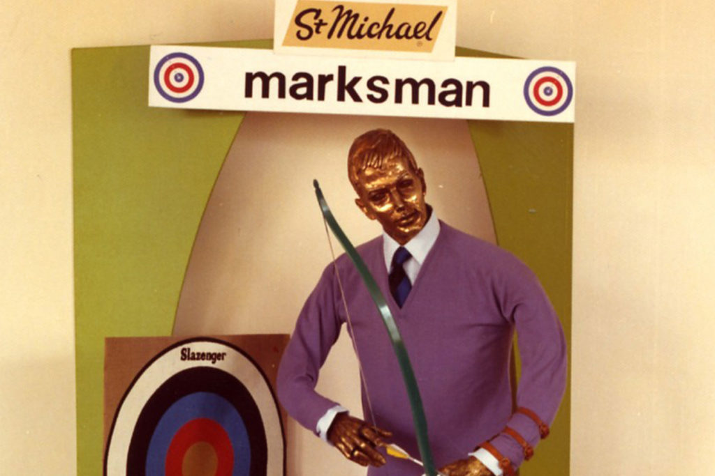
The Marksman campaign was trialed in 1972, with bold colours and the tagline ‘For Today’s Marksman’.
This campaign targeted male customers directly for the first time. Although sales increased during the trial period, the colours were considered too gimmicky and the campaign was not rolled out nationally.
By the early 1980s, store decor hadn’t changed for several years and ‘stores looked drab and dreary with ugly brown carpets and low counters.’ Judi Bevan, The Rise and Fall of Marks & Spencer, 2001.
Within two years half of our UK stores had a new look, with pastel colours and light wood, wider aisles and better lighting.
The effect was dramatic and immediate…
‘in one store business doubled in a week when we changed the scene but not the clothes’ Judi Bevan The Rise and Fall of Marks & Spencer, 2001.
We introduced mannequins in 1983, allowing store display teams to show customers complete, co-ordinated outfits.
In 2000 we developed the NVQ Level 2 in Visual Merchandising.
This was the first time Visual Merchandising, or VM, had been recognised as a formal qualification. The number of Visual Merchandisers in stores increased as VM became a core part of all retail areas.
We introduced clearer layouts and brighter environments. M&S Food Hall design moved away from a supermarket feel to specialised deli counters and bakeries.
In clothing, our new sub-brands determined store layout. However, this meant that it could be hard to find items quickly. Layouts were reviewed and changed back to grouping clothing by garment type rather than brand.
Visual Merchandising teams today focus on hitting the ‘sweet spot’, attracting new customers whilst retaining our core customer.
Emphasis is on garments that can be worn by all ages but styled differently, so styling showcases outfits that can be tweaked to suit.
We’ve also changed the language we use to better fit how people wear their clothes, for example Formal is no longer a category, instead it’s Smart Casual.
Stores are now less ‘inspiration led’ where garments were grouped by occasion, and more ‘item led’ with products grouped by type like denim, knitwear or coats for example.
These changes have made our stores easier to navigate, while still showcasing the versatility and quality of our products.